Pages

Sunday, 2 December 2012

Pandemic Pictures Logo

We decided to have a black background to help make the picture stand out, drawing the audience in from it looking bold and striking. It also shows a mysterious side as the whole image links into the conventions of horror which was our aim of the task. The image was found off of Google images, but our group didn't want to use somebody's picture so we decided edit the image to make it our own. I started to change the orientation of the image making it from a portrait to a landscape by cropping the image, as we thought this would help make it look my presentable for a logo of an institution. I started to make the image a higher contrast to help make the image feel more empowering and give a sense of tense which helps link into that mysterious feel. The original image also had trees in they eyes with leaves which we thought represented life, but as clever we thought that was we wanted to make our image original and have a disorientated feel, so I started to edit the trees out of the eyes, but left two branches. We then came together to decide if this image was suitable for our institution and it wasn't, so I then started to blur the branches to help give it a more disorientating feel. We decided on the image to represent our institution by being our logo because we thought it represented a 'pandemic' side which was what we wanted to happen i.e a bombing or a gas attack.
We planned to have music with our logo for example, a bomb alarm/siren  to go off in the background when our production company shows up on our main film. This is effective as it will make the audience jump form with a sudden shock of the sound and remember it which was key. The sound also helps us link to the the meaning of our production company which was intended.
The font we chose for our logo was Times New Roman font. This helps show are name in a very sophisticated way, and also helps make our institution company look very sophisticated and experienced. We also used the white text to make the text standout on the black background, making the audiences attention get drawn in with in the piece. Finally we thought it was very important to have our text in capital letters to make it stand out to the audience showing the importance, power, and experience within our logo.
Written and Designed by Emma Bradshaw (me)


Sound Definition

Saturday, 1 December 2012

Preliminary: Shooting Scehdule

Made By Zak Rodgers


Preliminary Task-Evaluation

Video only does question 1, 2 and 3


Preliminary Story Board: Animatics

Preliminary: Storyboard

Storyboard made by Zak Rodgers.


Preliminary Task: Roles

 Zak - Zak's main role in the preliminary task was the acting. He played the character of the unnamed male in the scene that the girl (Kelsey) meets. However we did not just want Zak to act as we thought it would be unfair for him not to get any equal practice with in shooting the preliminary film. So we decided to cut the storyboard into four sections where we could equally have a turn in shooting. Zak therefore helped shot the long shot of the house as the girl is walking up the path, and the aerial shot of the girl walking to the door.


Kelsey - Kelsey's main role in the preliminary task was the acting, however she had a much larger part of acting than Zak did as she was in every shot, therefore meaning she could not shot as much of us. Kelsey payed an very important role of her being the girl who has a timid attitude but a very brace character, as you see her walking in the dark confronting the male character. Kelsey came up with most of the shot types and angles and helped us with figuring out the shots we wanted at the end of the day therefore equally spreading our work equally.


Hannah - Hannah's main role was shooting the opening, however the main role she took place with was the 360 degree rule shot of the conversation in the dinning room between Zak and Kelsey  Hannah also came up with a very good idea which proved very useful and helpful by using stickers to place on the floor where the camera is to keep it in the same position. Hannah was a very useful part when shooting the film as she came up with all the lighting ideas when the switch on and off which was crucial to add tension between the film and viewers.


Emma (me) - My main role was very similar to Hannah's main role. My main role was to mainly shoot the film opening, with also helping out with directing and filming. At the beginning, when we started to make the film I and my group member Zak came up with the idea for the first shot which was an aerial/ medium shot. This is when the viewers get a surrounding of where the film is set, this creates a sense of realism for the audience as the house and where is it set is an ordinary location, therefore creating the idea of it happening to anybody which is quite threatening. I also thought of the light switching on in the top window, this therefore makes the audience feel as is someone was looking down on the girl therefore making her seem even more innocent and vulnerable. I also done some camera shots within the preliminary task and helped my group member Kelsey of the view of the girls feet walking past and also helped my group member Hannah with the 180 degree rule of when the characters are having a conversation.


Preliminary Task-Script

Here is our script that the actors worked from for our film opening preliminary task:

ZAK: I knew you would come
KELSEY: Why am i here?
ZAK:You know why your'e here, the time has come and know you must pay for what you have done.

We decided to keep it short and simple because for the preliminary task you don't have to 2 minutes long, we also decided as we thought if we stop when he says "know you must pay for what you have done" the viewers would want to know whats she has done and why she must pay, therefore continue on watching the movie.

Preliminary Video

Here is my mine and my groups Preliminary Task Video


Preliminary Task-Pratice Run

To Start of with the preliminary we filmed all of our groups ideas. We did this task as a group to help make a guideline to structure our real preliminary task. It showed what shots worked and what didn't so that when we shot our preliminary we can  concentrate on sound and  mise-en-scene.

Preliminary Task-Pratice Run Story Board


Preliminary Task - Silent Movie Research

During out first lesson when discussing the genre of our preliminary and coming up with ideas, us as a group came up with many different types of films that we could do. One of the main ideas we all seemed to like quite a lot was to do a silent film and have the dialogue written inside a frame. Such as the one to your right.
However, we decided against this as it would take a very long time to edit, to find the music we wanted which needed to fit and we wanted to concentrate on the mise-en-scene, camera shots and angles for the preliminary so we had an idea of what worked and what didn't. Our second choice was to do comedy. Our idea was of a prank gone wrong. We eventually decided against this idea as we though would be more useful to do the horror genre because then we would be able to practice appropriate camera-angles, mise-en-scene and sound that would create a horror atmosphere, helping us make our main task more polished and professional.


Preliminary- Brainstrom Prezi

Here is the prezi I created for my own brainstorm to help my group with ideas of the preliminary task.

Preliminary Task- Brain Storm


Here are two Brain storms my group made for our preliminary. The first one was made by Kelsey Duffy, the second one was made by Zak Rodgers.


Friday, 16 November 2012

Psycho Essay Extract

Here is an extract of my essay I done for classwork on Hitchcock's amazing film Psycho.


Thursday, 15 November 2012

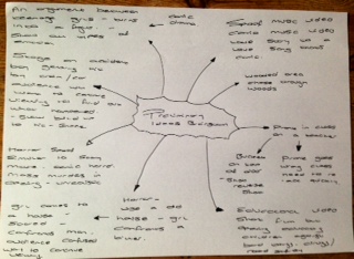
Mind map of thriller conventions

Romeo and Juliet timeline

A timeline opening of Romeo and Juliet

Romeo and Juliet 9 frames

Here are my main nine screen shots of the opening to Romeo and Juliet. I chose these shots as i thought they resembled the film and gave a clear understanding for the viewers to get if they have not watched the film.

Titanic Timeline

Timeline for the opening of Titanic

Titanic 9 frames

Here are my nine screen shots of the titanic opening, I chose these shots as i thought they were the most important shots of the opening of titanic. The opening of the film is in the edit of sepia which lets the audience know what the date and time this film was set in.


Pyscho timeline

Timeline for the opening of psycho

Saturday, 27 October 2012

Pyscho film opening 9 frames

Here are my nine screen shots of the physco opening, I chose these shots as i thought they were the most important during the film opeing. The first one shows the company and productions of the clip which can let the audience now what they are watching and how good the other films they produced are and so on.


Sunday, 14 October 2012

Institution of a Big Multinational Company

Paramount Pictures corporation  is a global distributor and producer of filmed entertainment. It has robust and multi-faceted divisions across all areas including digital, home entertainment, network and cable television distribution, studio operations and consumer products and recreation.
It was founded in 1912 and is currently owned by conglomerate Viacom and has a major film studio still headquarted in the Hollywood district of Los Angeles.
The most popular films they made are Star Trek, Indiana Jones, Transformers, Paranormal Activity, G.I. Joe and many more.


20th Century Fox is also a film corporation which is one out of 6 major American film studios  It was founded in 1935, which has become the most recognized film institution in the world.
This institution prefers to make comedy/fantasy and family films as they seem to be most profitable. however they also seem to  create horror films for example. Hell, Alien, The Omen, Jennifer's Body, The haunting of molly Harley and many more. Some of the most successful films created are avatar, Star Wars, The chronicles of Narnia and Speed.

Institution of an independent company

Twisted Pictures is an American Independent production company, mainly creating films the genre of horror. It was formed after the box office huge success of Saw in 2004, this lead to an successful nine picture distribution deal with Lionsgate. The company then went on to produce six sequels.
Other movies include Saw II, Saw III, Catacombs, Dead Silence, Saw IV, Chain Letter etc.
Company was founded in 2004 by the Evolution Entertainments Mark Burg, Oren Koules and Gregg Hoffman. (Known for producing the Saw Film series.
I would want this company to be in with my film as they have been very successful with all upcoming horror films.


Lionsgate is a Canadian entertainment company, which was formed in Vancouver but its headquarter is in Santa Monica California. Since 2007 it has been the most commercially successful independent film and television distribution company in North America. They have produced and distributed motion pictures, TV programming, family and home entertainment.
The majority of their films have very similar genres which are drama, action and thriller/horrors. However thriller and horror was not their strongest point. This information is very important when i come to deciding whether this film institution is suitable to create my horror film.

Audience Research- Horror Title Sequence

Below an example of the computer made questionnaire i created can be seen.


My results

The image below is a screenshot of the spreadsheet I made in order to show my results and the data we had collected. I added conditional formatting to the cells I had selected (columns B and C) to make it clearer and easier to read. In column A, I set it to turn automatically green for the people we were aiming for, red for the ages who are borderline and yellow for the ages who we are not specifically aiming for. In column B if the gender is male the cell will turn automatically blue and if girl red/pink. All of this processes turns automatically when the data is entered.


Age and Gender

Before we even started to shoot or plan our film the first question was to gather information about the age range of people who watched horror films, and what age would our film be suitable for. The second question we asked was what gender our audience are. The two images below shows the most frequent ages we collected and the gender of the people who completed our survey questionnaire.

16     16    16   17   17   17   18    36   42

Your Gender


Genre 

Once I found out the gender and age of our applicants we then wanted to find out and research what sub genre of horror they preferred. I quickly found out that psychological Horror was the most popular so we decided to base our film around this.

   Favorite Genre of Horror


Actors

When then wanted to find out the audiences preferences on actors, and from our research its shows that male characters are most preferred in horror films. This lead to us picking a little boy for one of our main parts.

    Main preferences on the main actors 


Favorite Horror films

We thought as a group that maybe asking what peoples favorite films were, to give us and idea of the sort of story line people enjoy the most , and the Paranormal Activity series of films were the most popular. We then hope to in corrupt some of its well known features recreated into our film.


Setting

I then wanted to find out what peoples favorite locations were in film horror genre. One of the most popular answer we got was a house, so my group also decided to incorporate that into our final film (we also used an abandoned woods at the beginning of the clip).

         Preferred horror film setting


Credits

I was pleased to find out that most of the majority preffered the credits to appear on the opening footage, as this was one the things me and my group had decided to do at the beginning of our film opening.

       Do you Prefer credits at the beginning of the film or completely separate opening credits in the opening of the film?


Sound

I finally collected information about sound, but as a group we decided to keep it all natural on the clip of the girl at home and creepy, quiet nursery rhyme like in the dream section. I was please with the feed back I got because most of the votes were for quiet and creepy music. This soundtrack will help create suspense and help us create more dramatic false climaxes.

        What are you sound preferences?


'Trick r Treat' cover analysis

Films use a combination of posters, trailers and lots more of other advertising techniques. For my AS media task we have to create an opening of a horror film, as well as creating our company logo. So i decided to do some research into film covers, in what draws us in to thinking whether or not to watch it. I have decided to do this mainly on horror and thriller films so it would apply more to my work.

Saturday, 13 October 2012

'Scream' cover analysis

Here is another film cover analysis I did for extra research to help me with my final horror film opening.

Tuesday, 9 October 2012

Nightmare on elm street detailed analysis presentation

Here is our groups you tube detailed analysis presentation video on the film opening Nightmare on elm street. In my group were Max Farmer, Flynn Jarvis, Emma Bradshaw, Emily Millet.


Nightmare on Elm Street detailed analysis

Here is the video of our groups presentation by Emily Millet, Emma Bradshaw, Flynn Jarvis and Max Farmer

Script for Nightmare on elm street

Emma: 
·         Title flashes in red to resemble blood and death, which links to the genre of horror.
·         Film Company is shown.
·         Screen fades completely black to add tension and mystery, and also links with the main character going into a dream.
 Emily:
·         The small screen suggests that this is an important part of the story because it you have to focus more on it. You can't see the man’s face which adds mystery and tension for the audience.
·         Producer is shown
Flynn:
·         You can tell the man’s intentions aren't good because the close-up shots highlight the fact that he is building a deadly weapon.
·         creepy breathing links with the conventions of horror, and suggests the character has some sort of disfigurement?
·         The Director's name is shown, and due to it being a well-known name it attracts a wider audience.
Max:
·         The title of the film is shown, and ‘Nightmare’ is large and bold to suggest that it will have something to do with the film.
·         It's a creepy font style, the red signifies blood, and the title animation makes it seem like it's creeping up on you; which again links with the theme of horror.
Emma:
·         Enters the character of a woman, the white background makes her look pure and innocent which juxtaposes with the theme of horror. Through an extreme close-up shot, we can see how terrified the girl is, and she is also dressed in a white night gown which shows she doesn’t belong in the environment.
Emily:
·         Extreme long shot, shows setting (long dark creepy hallway), links with the conventions of horror. She is on her own to show she’s isolated from civilisation.
·         There is a bright light in the doorway (associated with death) and she runs away from it, suggesting she doesn’t want to die.
 Flynn:
·         There is a close-up shot of the character’s face, and she is partly hidden within a shadow, which creates a suspenseful atmosphere as the setting is very poorly lit.
·         A zooming shot is used to create the effect that someone is approaching her from behind.
Max:
·         The audience is scared as she turns around, but we realise it’s only a sheep. Sheep represent new life, and this juxtaposes the girl’s situation- which is death. However the sheep links with the girl as they are both young and ‘pure’. 
·         There’s a face hiding behind a wall, which shows that she is being watched, which creates fear in the scene.
Emma:
·         The music is very suspenseful, and adds to the sense of tension within the film.
·         Rattle of chains, symbolizes the feeling of being trapped. For her this would mean her being trapped in this nightmare.
·         More important crew members are shown in the credits
Emily:
·         We can see that the setting is very vast through this extreme long shot, and we feel for the girl even more as we know she will have difficulties escaping.
·         In the distance the laughs of the killer are heard, and this contrasts the girl’s fear.
Flynn:
·         The camera is following her from behind, and this creates the effect that she is being watched and pursued.
·         The steam and mist in the factory add atmosphere, and link with the conventions of the typical horror scene. Red lighting also symbolizes death which could be foreboding.
Max:
·         Close up of killer’s claws, and this scares us as we know it was the weapon seen in the beginning. The noise also sounds similar to nails scratching down a blackboard- makes most people cringe.
·         The use of a hand-held camera following her running away makes it seem even more suspenseful, as it seems like it’s from the Point of View of the killer.

Emma:
·         She has nowhere to run, and the fire behind her adds to this feeling of being trapped.
·         As the girl screams, so does the sheep. This connects them both further as they are both equally defenceless to the killer.
Emily:
·         The killer appears from behind her and she gets caught, and this makes the audience jump. The setting changes and she wakes up in her bedroom, and we realise it was actually a dream. Match-on-action shot?
·         Equilibrium is restored, as she is now at home; which is a stereotypically ‘safe’ place.
Flynn:
·         However, there are still cuts on her dress, which makes us question if what just occurred was actually real, and this generates tension. Also the lighting is still dark and shadowy, making the audience feel uneasy.
·         We are made to wonder if the killer will return into her dreams, and whether or not she is actually ‘safe’ in real life.
Max:
·         The cross on the wall in the background also could be quite ironic, as despite her thinking it will protect her, she was injured in her dream.
·         After this scene, the audience is left wondering what will happen to her next, and through the use of this opening the audience are now hooked into the storyline of the film.

Sunday, 7 October 2012

Alfred Hitchcock

The Ring

Another group in class had to do a presentation on a horror opening film was Zoe Woodhouse, Kelsey Duffy, Max Canning and Ellie Bull, they done there opening of the Ring and gave feed back of what they found out. The opening starts with the production of the film which is DreamWorks Pictures but is shown in a static style that has been changed to fit in with the movie which is to show a classic convention of a horror film.
     The first scene of the ring the viewers see is a long shot of the house. The house is in the middle of a woods and set a nighttime with only one light one in the house which shows how isolated the house and people who are in it are from anybody else, this creates the people and the house to seem very vulnerable which fits in the environment being unpleasant which is one of the conventions. It then switches into the girls of a medium/long shot of the bedroom which is quite a contrast from the outside view as it is cozy which makes the viewers feel safe and homely, but at the same time the television flashes images which flashes images onto the background making the viewers think they saw something which builds up suspension and tension.
       Whilst the characters have a conversation this is when the shot reverse shot happens, after the conversation reaches climax from the scary story there is a drone tension, this makes the audience tense but then there is an anti-climax as it seems the character is joking about the story which shows the type of relationship these characters share. It then appears that one of the characters is dying and starts to collapse and choke with an over the shoulder shot which makes her look vunerable, which makes the audience scared and worried  about what is happening but then there is an another anti-climax when the viewers realize she is not dying but faking her death as a joke.
       The tension begins to build again when the phone starts to ring, both of the characters start to feel uneasy and begin to tremble which also make the viewers feel this way as well. Both of the characters are not fully clothed which makes them feel uneasy and vulnerable. When they answer the phone it is a close up shot to show its importance, characters emotions and how is has a dramatic effect of the characters.

       The next scene is when the television turns on whilst the camera is focused the on the girls face, this is showing the viewers that something is wrong by her facial expression. The television is then shown, this creates tension when she turns it off and it switched back on, she then desperately pulls the plug of television not regarding her safety, which shows how urgent she is within the situation, then a loud wind like noise (diegetic) occurs behind her, as the camera focus's where it come form a certain figure moves off screen to show the viewers something unpleasant is happening.
       The next scene is a shot of the girl looking up to the stairs, this shows how worried she is while the camera angle is coming from top of the stairs looking down making her look vulnerable. There is then water of the floor, however in the reflection the girl can see the television flashing makes the girl wonder what it is. She then opens the door an the static noise occurs(non-diegetic) again but faster with unpleasant noises and then more scenes occur and you get a glimpse of the girl dying with the opening scene ending making the audience questioning if what they just saw was real.

The Grudge

In class we got put into groups and got set a task of doing a presentation on a horror film showing all the key conventions of it. One group done a presentation on the The Grudge, the people in this group was Hannah Edwards, Zak Rodgers and Van Abner.
The opening scene reminds the audience what they are viewing which is a horror genre as there are drops of blood which could resemble death. With this there is also dramatic music (non-diegetic) which is iconic as it goes with the effect of blood as the background There is also hair flowing through the opening credits which makes the audience know the film that they are viewing is the Grudge.
The first couple of scenes that appear in the opening are the credits that are mainly off the actors and crews but are surrounded by blood which makes the viewers feel tense and uneasy and then the background changes to red which could represent death, danger, also the font of the credit language makes the audience know it is set in Japan which could mean they could get background information on what it is about and the story line.
There is a close up shot of the pale girl with wet hair which could make the audience feel uneasy and sorry for her as she looks so innocent and vulnerable. The next scene is a flash back which involves a fight scene involving the girl and man which the audience presume that it is her father, when he then breaks her neck. The viewers feel very sorry for the girl as it shows her innocence and vulnerability again. After this there are violent and disturbing scenes on the man killing his son and a cat, this creates the audience to become uneasy and to dislike the character of what he has committed so far in this film.
The flash back stops and is back in the present day, we know this by the long shot type of  the house. It is not a pleasant, homely house with chains around the gate which shows that nobody should ever go past and enter this house. There is then a trademark of the attack which the film 'Grudge' is most famous for. This is the girl who got her neck broken slowly creeping down the stairs  then showing the audience her killing people. This completely narrows out any sympathy the audience ever had of this girl and starting to dislike her character for knowing what she has done.